Continuous and automatic key driver analysis of customer feedback
by Manuel J. A. Eugster
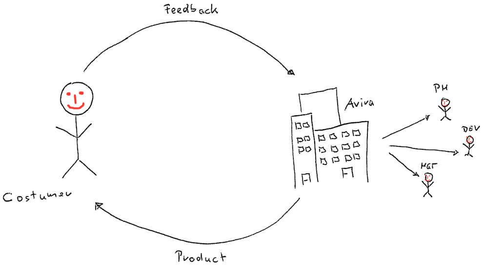
In all of Avira’s products, customers are able (and invited!) to provide feedback whenever they feel the need to tell us about their experiences with the products at hand. This feedback does not disappear into nirvana—instead it is collected, automatically analyzed and distributed within the company to relevant stakeholders. Product managers and developers—to name a few—use the processed feedback to make decisions for future product releases.
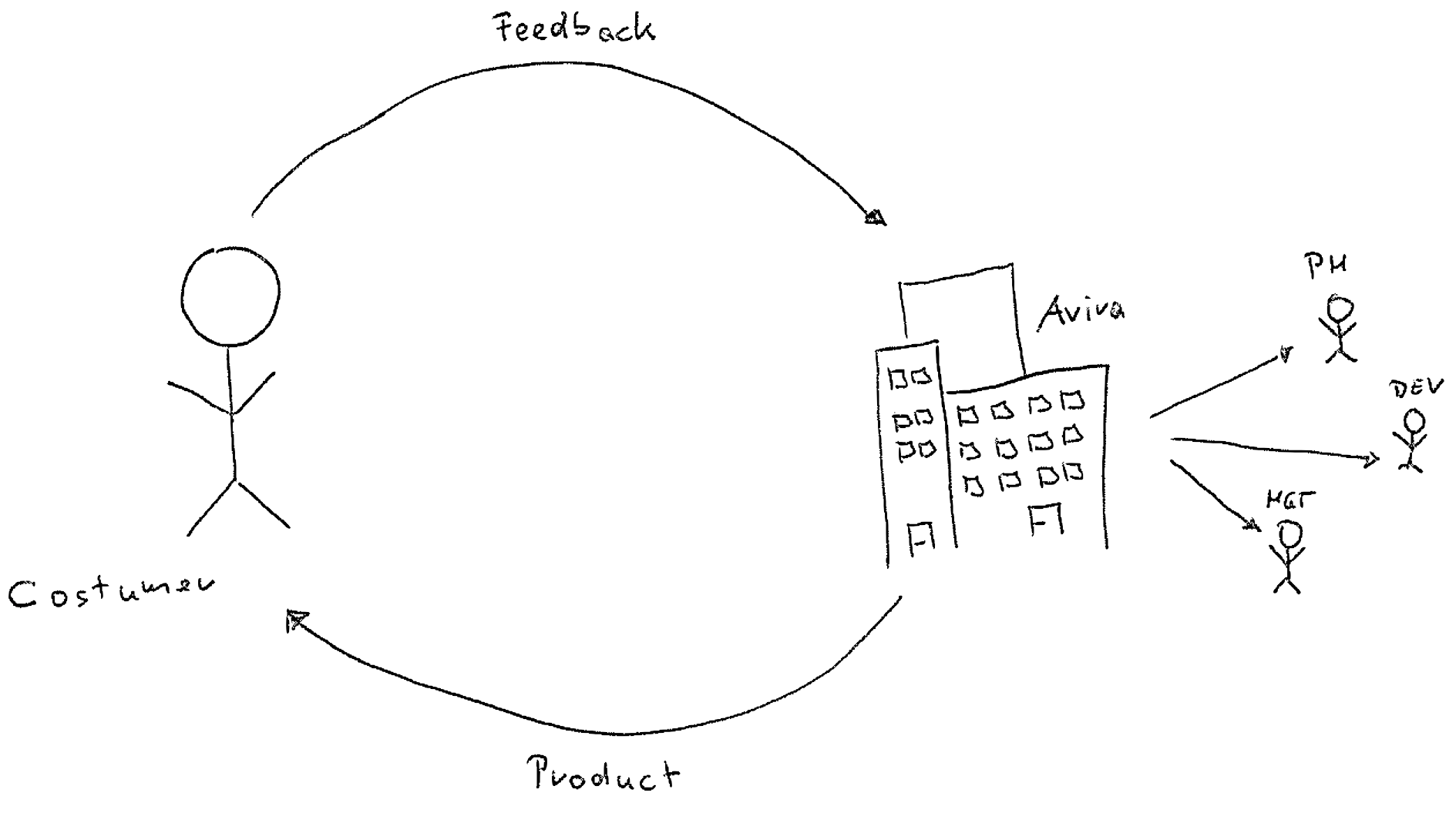
At Avira we try to use the terms data-driven and customer centric not as buzzwords, but really execute on these two concepts. The automatic key driver analysis for customer feedback is one example where we developed an end-to-end pipeline to provide a basis for decisions on data collected from customers. In general, a key driver analysis is the study of the relationships among many factors to identify the most important ones. In our case, we are interested in the relationship between the general customer satisfaction and specific joy and pain points customers experience during the usage of our products. Such an analysis results, for example, in an estimate on how much the decrease of the customer satisfaction score is, given that a customer complains about a problem with the automatic update of our Avira Antivirus product. If this decrease is significant to other complains, we know that this issue needs to be prioritized.
In this post we will present the full end-to-end pipeline for the continuous and automatic key driver analysis in detail. We will illustrate the infrastructure and discuss the statistical model used behind the scenes. This is work developed by the Customer Insights Research team1 at Avira.
Customer feedback
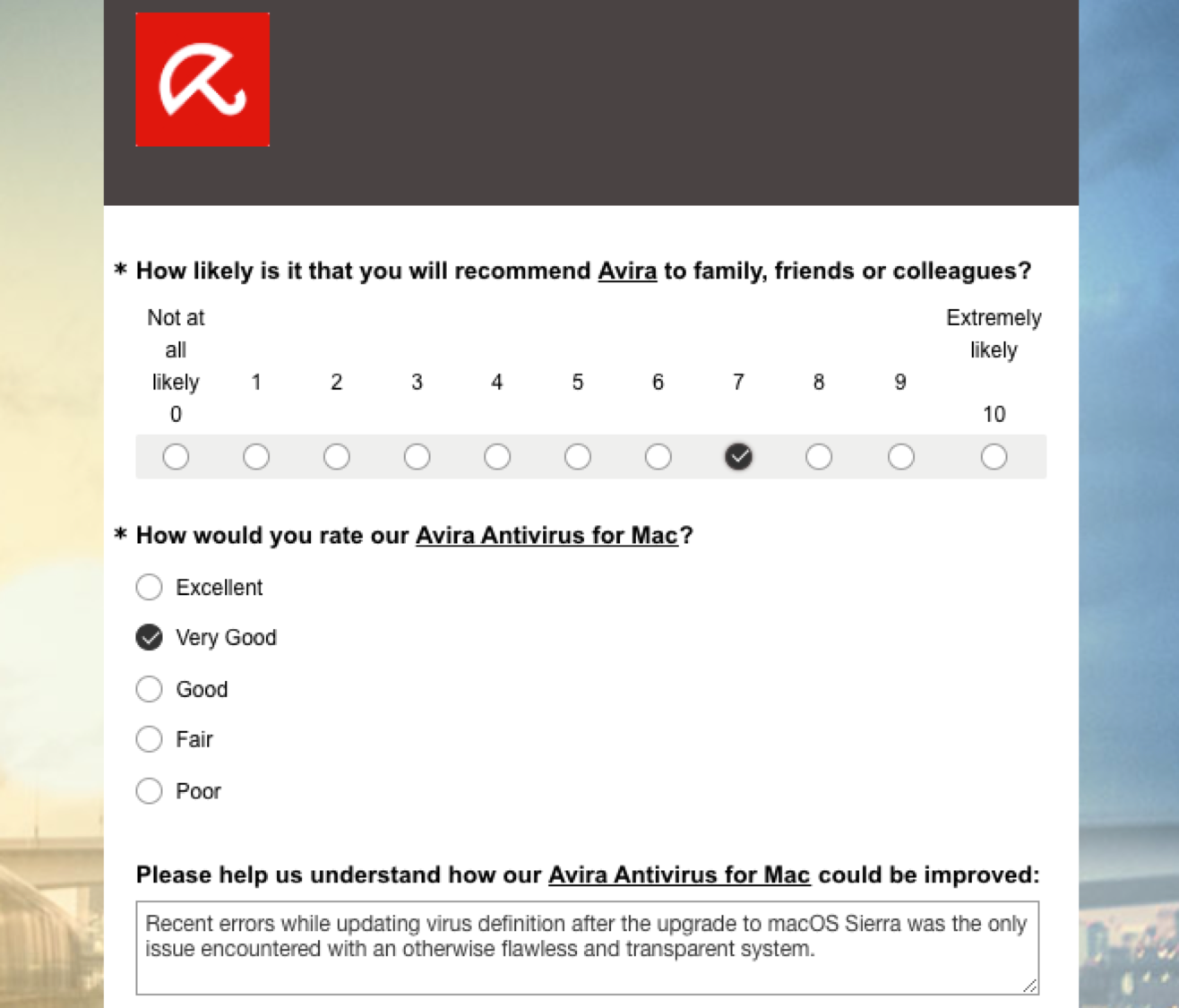
If a customer decides to give feedback, he or she will be forwarded to a product-specific survey. Every survey starts with a set of questions standardized throughout all Avira products and touch-points:
-
The first question is always the Net Promotor Score (NPS) question on how likely it is that you recommend Avira to family, friends or colleagues. The rating scale is from 0 (Not at all likely) to 10 (Extremely likely).
-
The second question is the Customer Satisfaction Score (CSAT) on how you would rate the product at hand. The rating scale is from Excellent to Poor (note that this is an unbalanced Likert scale).
-
The third question is an open text question on how we could improve the product at hand. The customer is invited to write about his or her pain points as well as joy points while using the product.
Now, in order to gain insights into the provided customer feedback, we assume a relationship between the customer satisfaction score (question 2) and the content written in the open text (question 3): If customers are satisfied with the product, they will write about their joy points; if they are not satisfied they will write about their pain points. We want to understand how strong the influence of individual joy and pain points on the customer satisfaction scoring is.
End-to-end pipeline
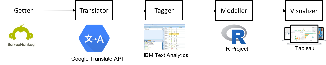
Our end-to-end pipeline from the customers to the stakeholders within Avira works in principle like the following:
-
Customer feedback is collected with the SurveyMonkey service. A Getter job continuously collects the latest survey responses via the SurveyMonkey API.
-
We collect customer feedback in 13 different languages (from English and German to Traditional Chinese). A Translator job automatically translates the collected texts into English via the Google Translate API.
-
We use a dictionary approach to tag the open text feedbacks with Avira specific tags. A Tagger job using IBM Text Analytics categorizes the joy and pain points written as open texts into tags.
-
A simple statistical model estimates the relationship between the customer satisfaction and the tags. The Modeller job with the implementation of the statistical model is implemented using the R language.
-
Finally, the results are visualized using a Tableau dashboard.
Most of the underlying extract, transform, load (ETL) jobs to access APIs and read/write databases are written in the R language.
Key driver visualization
In order to make the results—the estimated key drivers for customer satisfaction—accessible within the company, we use a simple visualization created as an interactive Tableau dashboard.
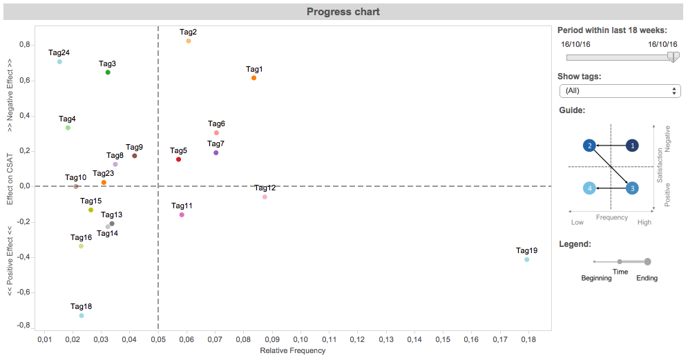
The visualization shows the key drivers for a specific product (the real tags are anonymized to Tag1, Tag2, etc). On the -axis the relative frequency of the tags is shown and on the -axis the effect of the tags on the customer satisfaction score (CSAT). A negative effect is shown as an increase in the CSAT score (towards the top) and a positive effect is shown as a decrease in the CSAT score (towards the bottom); no effect is at .
To provide guidance for interpretation we split the visualization into four quadrants using the mean for the relative frequency (-axis) and for the effect on the CSAT (-axis). The two top quadrants contain tags with negative impact on the CSAT, the two bottom quadrants with positive impact on the CSAT. The two right quadrants contain tags with a high number of customers talked about, the two left with a low number of customers talked about. Therefore, the most critical quadrant with tags that really need to be investigated is the top-right quadrant (followed by the top-left, the bottom-right, and the bottom-left quadrants).
In the introduction we used as an example the complain about “a problem with the automatic update of our Avira Antivirus” product. In this visualization, Tag1 is the tag “update problem”. This tag is in the top-right quadrant, so many customers complained about it and it also has high negative effect on the customer satisfaction score.
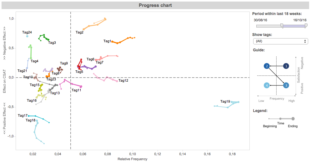
The visualization is also used to monitor the progress of tags over time. If, for example, a development team takes on an action to fix a specific tag, over time less and less customers should talk about this tag. Again, the “update problem” tag Tag1 is an example for such a scenario. For other tags, like Tag19, no action was defined, and therefore the tag continuous to be unvaried over time.
Inside the Modeller
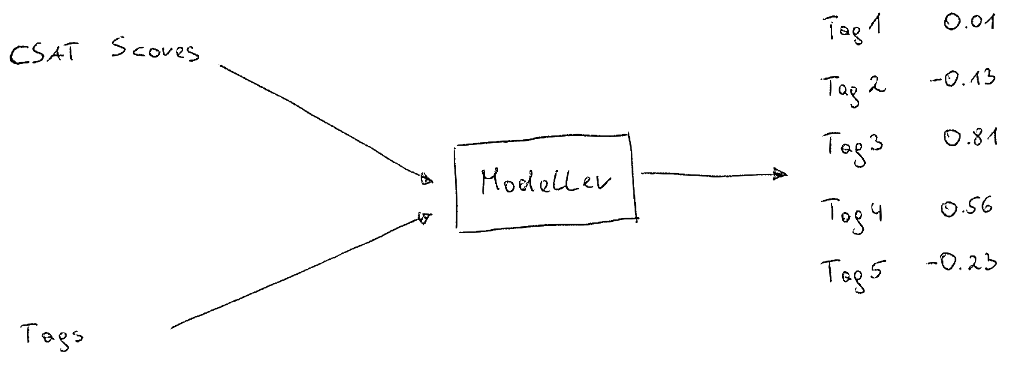
Now, the effect of specific tags on the customer satisfaction score is estimated with a simple statistical model. The model takes the CSAT scores and the tags as input and provide an estimate of the relationship between the tags and the CSAT score—we model .
The purpose of this specific model is to be a middle-term key driver analysis of the most frequent joy and pain points (represented as tags). This is reflected in our feature and row selection process.
Data
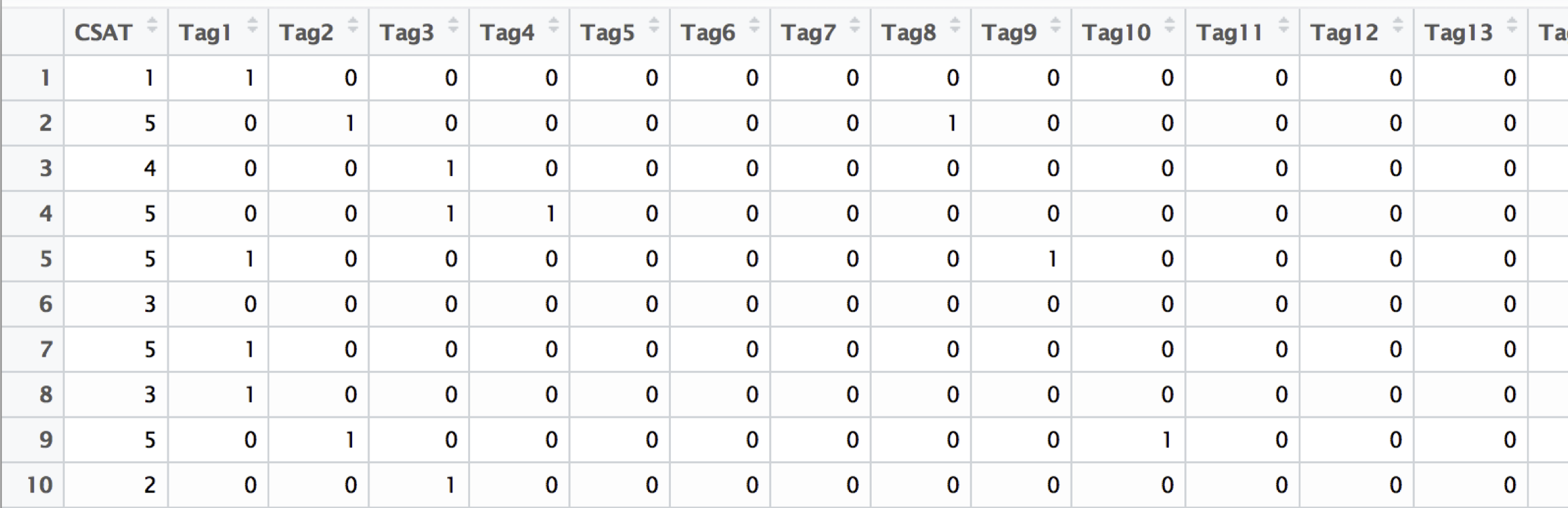
The data for the modeling problem is the following. The tags are represented as the design matrix , a binary matrix with observations (the number of customer feedback) and features (the number of tags). If on open text is tagged with a specific tag, the corresponding feature is , otherwise . The CSAT score is represented as a vector , with being “Excellent” and being “Poor” (following the German school scoring system; note that we ignore the unbalanced scale).
Feature selection. The purpose of this model is to focus on the customers’ most frequent tags. Because of this, a simple feature selection method to reduce the dimensionality of the problem can be incorporated. We only take the top- features, i.e., all the features () where , and is the th-largest value of the ordered column sums. Currently, we use and therefore monitor the 20 most frequent customers’ joy and pain points.
Rolling window. The model should represent a middle-term key-driver analysis. This means we are interested in customers’ joy and pain points, which are continuously existent for some time. To obtain such a model, we compute a rolling window model over the last weeks. Currently, we use a window of the last weeks, which works nicely with many of our product release schedules.
Linear regression
To estimate the effect of the joy and pain points (represented as the tags), we compute a linear regression (fitted with OLS):
with and . To recap, is the CSAT score given by the th customer, and are the th customer’s joy and pain points represented as binary tags.
Now, the interesting parts are the coefficients (). A specific coefficient tells us the expected change in the customer satisfaction score () when the corresponding tag is changed from 0 to 1 and all other features are held fixed. This is the estimated effect of the key driver—how much does this joy or pain point contribute to the customer satisfaction score.
Bootstrapping. To stabilize the estimated coefficients we apply case resampling bootstrapping. This means, we do not compute one linear regression model but different models, each one based on a random sample (with replacement) of the observations:
The final coefficient is then defined as the mean value of all estimated coefficients: .
Visualization. The coefficients are the estimated effect of the key drivers on the customer satisfaction score and are visualized on the -axis of the Tableau dashboard presented above.
Model evaluation
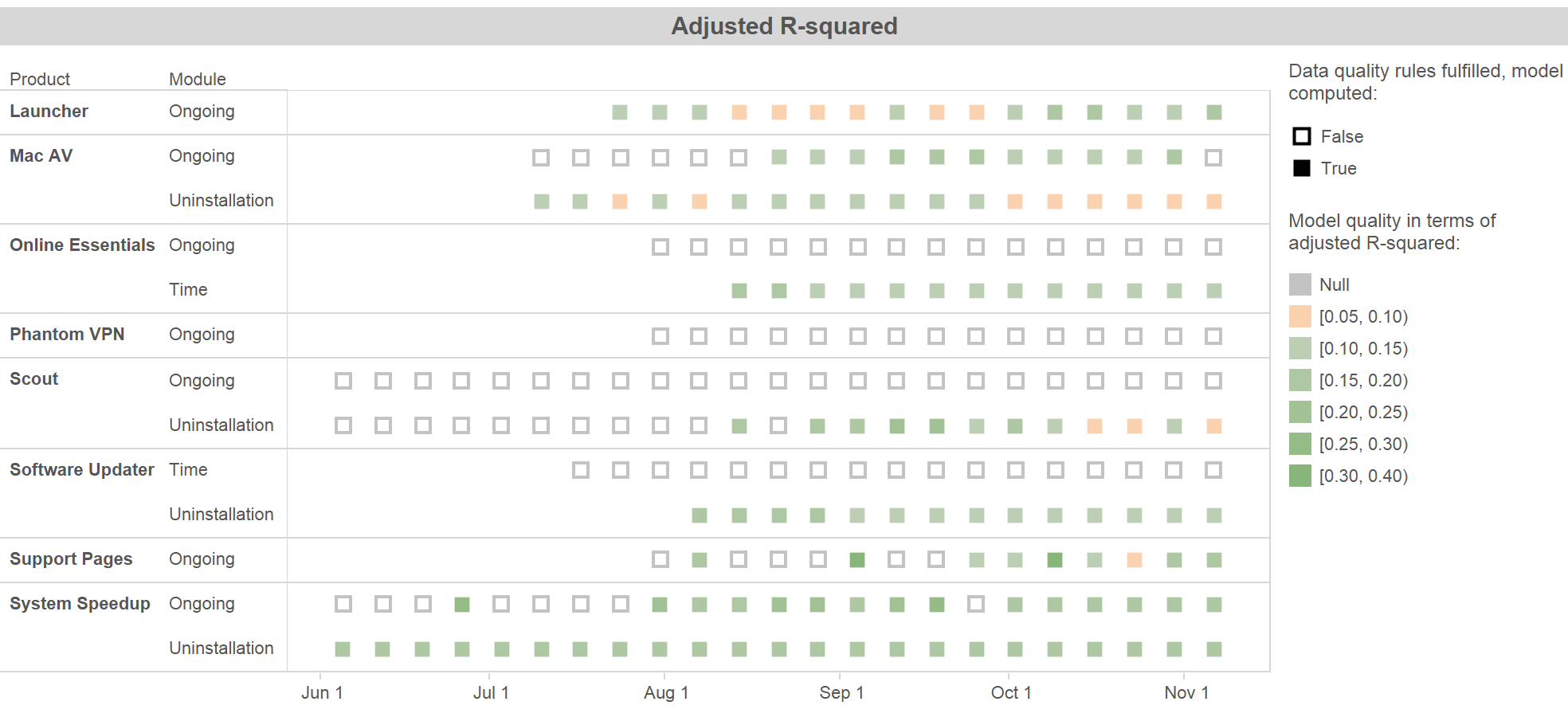
To evaluate the quality of the estimated key drivers, we monitor the adjusted value of the linear regression model (or more exact, the mean adjusted of the bootstrapped models). The figure above shows a Tableau dashboard with the quality of models for different Avira products over time. As you can see, the adjusted ranges between and . In a first evaluation phase we observed that an value higher than is acceptable (it is a real-world problem!), therefore we defined a color coding accordingly to this rule of thumb. We also have different data quality rules in place, if these rules are not met, no model is computed.
However, the real evaluation will be visible after a longer period. The models provide reasonable estimations of key drivers if our customers are happier because our products got better due to their feedback, and consequently, our revenue increases.
-
The Customer Insights Team consists of Michaela Beckenbach, Jürgen Lass, and Manuel Eugster. ↩
Subscribe via RSS